Website Project

Introduction to the Project
Welcome to the page that is all about this very website!
This was, and still is, our first true project. This website acts as our individual portfolios, with the purpose of showing off our work to those who may be interested, including our development processes and outcomes of projects. This page will go through the different stages of the development of this website and will continue to be updated as this website gets updated with new projects, styles and quality of life changes. This project was carried out with in-class assistance and after a six-week period, we were left to develop the website on our own, but of course we could request help. In these weeks we would learn the necessary HTML and CSS skills to create and develop our websites.
Stage one: Research Phase
So, let’s start right away with my introduction to the project. It started out as a simple researching activity, where we gathered ideas for styles and functions of our websites. I found a great website that shared a list of good example game designer and developer portfolios. Access it here. I found many styles and layouts that I liked and came to a final few that I would use, but not copy directly, to build my website. Here’s a few that I took note of.
I especially liked Mathias image layout with all the different character designs. I want to do something similar when displaying my sketches and their progress in the Personal tab as well as anywhere else it may be needed. I also really liked Josh Caratelli's website layout in general, but especially the distinction that he has made between each section.
Stage two: Development Phase
This is the biggest section of the project because, well it is pretty much the whole project itself. We will start with my first wire frames and my reasons for their design.
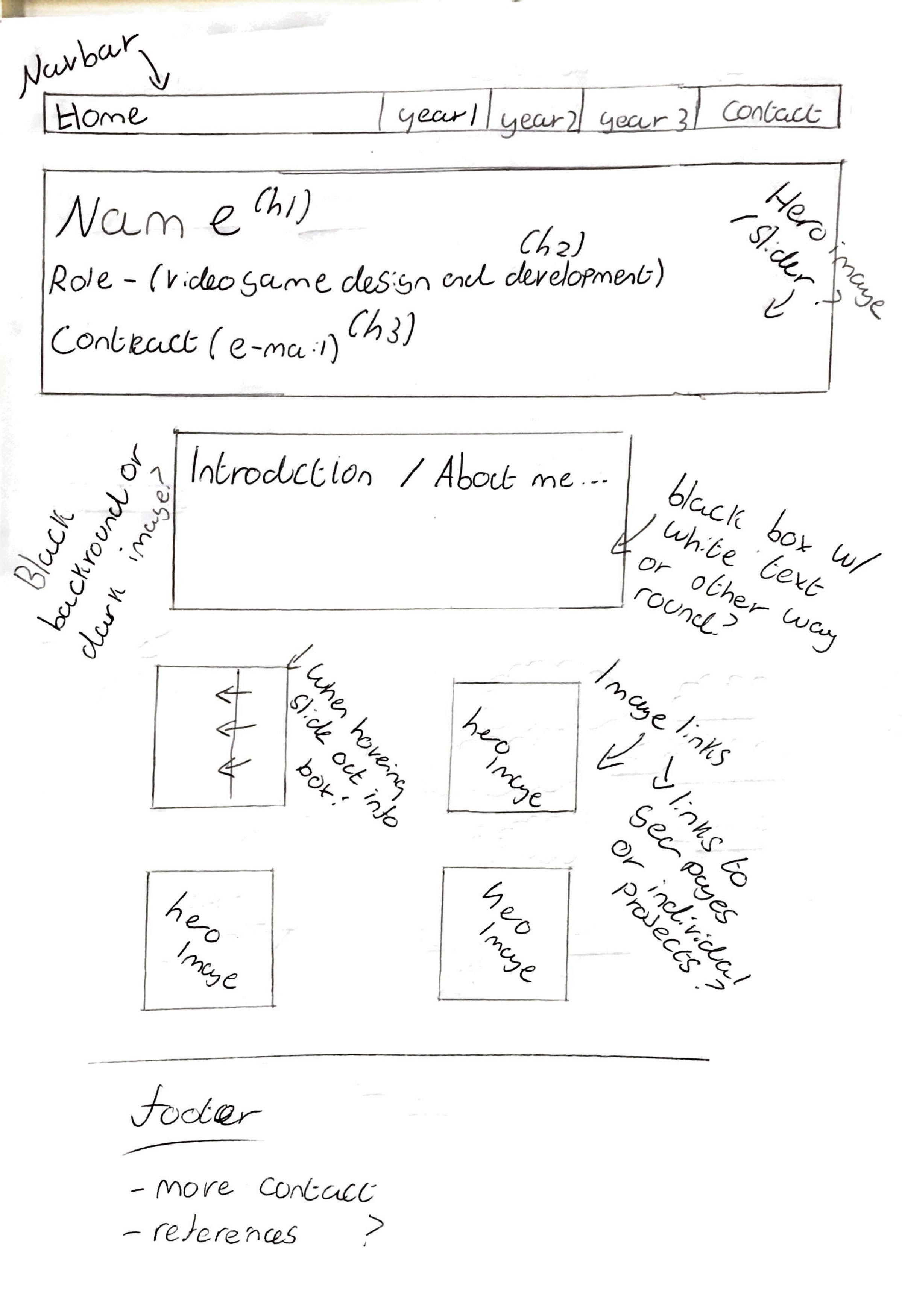
Nav Bar
I wanted to create a responsive navigation bar that would follow you down the page. This would include all the main pages like first year projects and a contact page.
Header
For this section I wanted to include a hero image/image slider that is behind key information including name, role and main contact.
Introduction & Projects
Here, I wanted a brief introduction to myself and what I am like. This was going to be followed by a list of square boxes including hero images of the project that it links to. I originally wanted an information box to slide out when hovering over the box as well.
Background
For the background my original plan was to have it as a dark, most likely black colour or even a dark black or blue background image.
Footer
At this point I didn't have many plans for the footer as I was going to have a separate page for contacts so I essentially left it as an option to hold any other essential information.
As for the pages that hold each project, I wanted to structure them chronologically from my first steps to the current progress so that it makes the most sense for the reader as it will hopefully be easier to understand my development process.
Learning the Code
Our next task was an introduction to basic HTML code. This included paragraph tags, different title tags, images and links. We also learned how to set up html files properly. We were also introduced to the 12-column-grid system that is a common strategy in website development. The clue is in the name as it literally divides the webpage into 12 columns so you can select how many columns an image will take up for example. The main rule was that any website aspect should start and end horizontally at the edge of a column. This allowed us to start building our websites to match our wireframes as closely as possible. Throughout the project we have also learned additional html such as different input types and an introduction to JavaScript.
We were given a few weeks to develop our wireframes into our websites before we shared our progress in small groups. At this point I had a nav bar that was quite basic. I also had a short introduction with a few images and text boxes from a game design project that I had carried out in the weeks before. All of this was on top of a dark black and blue background image that I had collected from Unsplashed Images.
As we were presenting our progress in our small groups, we gathered feedback. I was advised to add links and more images to my design to start with. A common goal among almost everyone was to add a responsive navigation bar, so this was most likely going to be my next big venture. At this point I was honestly very happy with my progress which made me confident going forward.
Navigation Bar & Re-styling
This was the point in the project when we were left to develop the websites in our own personal time. So, I wanted to start by creating a responsive navbar. I searched YouTube and found the perfect tutorial by FollowAndrew who thoroughly explained the process of each section of code, plus it required no Java script. Here's a brief explanation on each section of the code.
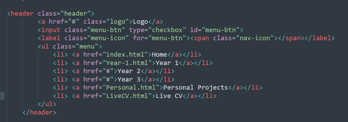 This section is all about what each part of the navbar will display including home, Live CV and the logo.
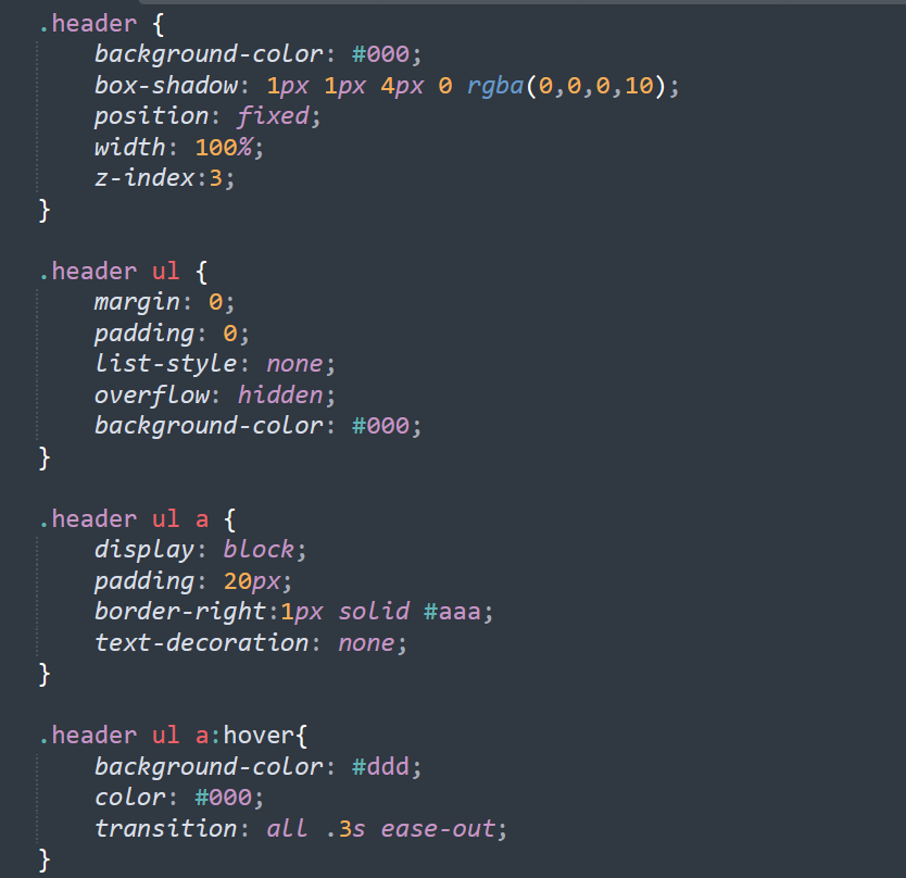 This shows the styling of the navbar including the background and text colours, box-shadows, margins and padding. There is also a small bit of code that states how each part of the bar changes as the cursor hovers over it.
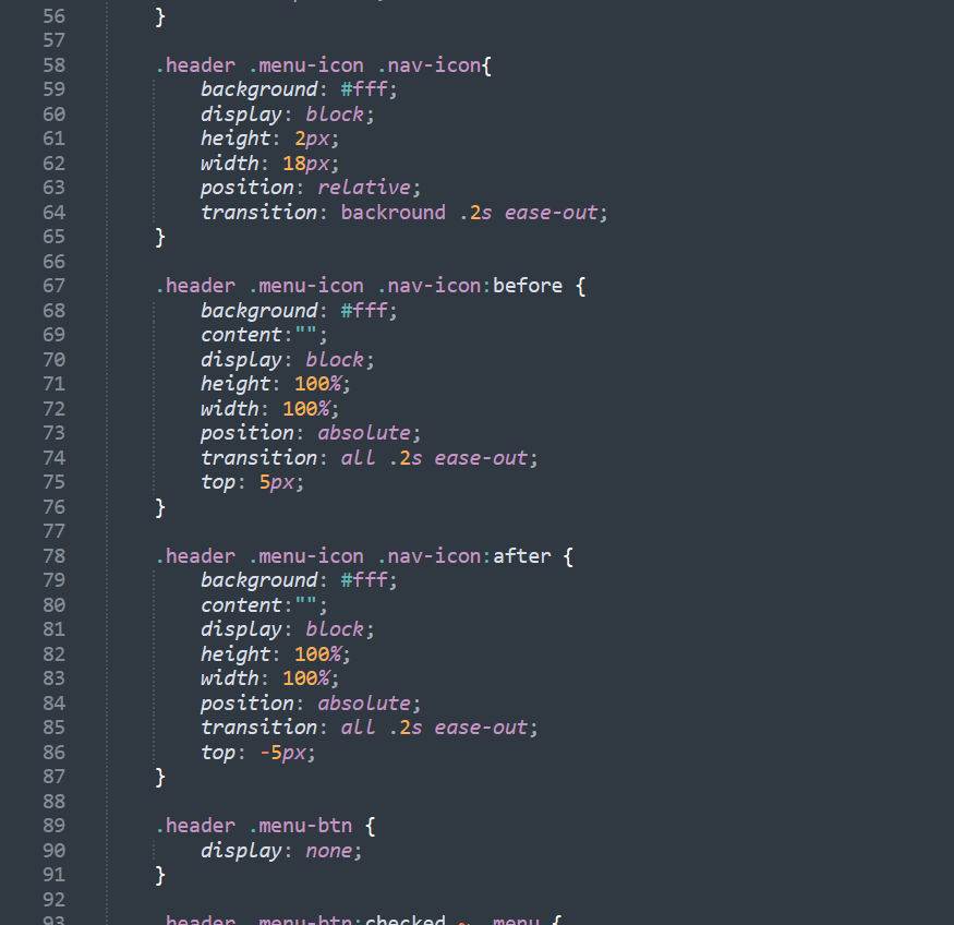
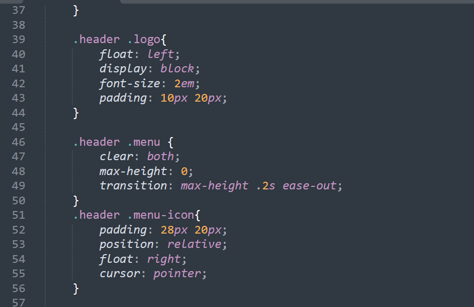 This shows the code used to create the different buttons on the navbar. There is the logo, menu, which is the Home, Year 1 etc and the icon that shows when this webpage is in a smaller browser.
 This shows the different states of the drop-down nav bar when in a smaller browser window, including the original, meaning in a default window, the before in a small window and the after in a small window. The before meaning when the bar is up and the after being when the bar has been dropped down.
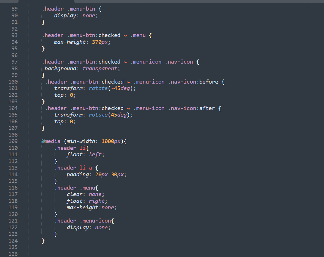 This code is all about the three-line icon that shows when looking at the page in a smaller window. There is code to change the look of the icon before and after it is checked (as it is classed as a checkbox), as well as animations for when it is checked.
I was going to show images here of the finished design of the navbar, but you can on the page yourselves. Try making the window smaller to see how the nav bar changes.
Designing the Home and Year One Pages
Next, I started creating the actual pages that the introduction, projects etc will be on. Before I show anything, here is the current colour scheme of the website.
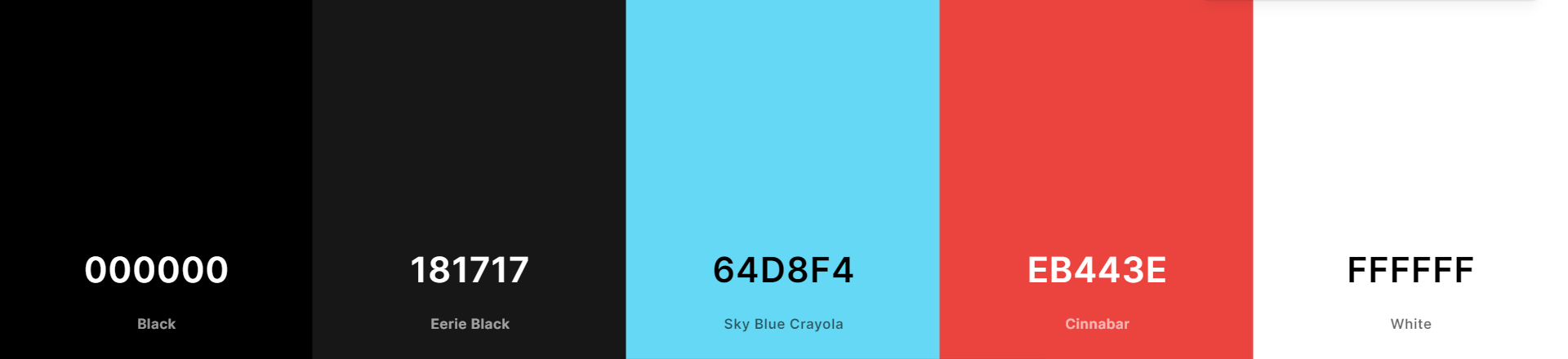
I picked these colours, not only because they are all colours I like, but because I feel that the dark and almost neon like colours fit the video game aesthetic. Now, you have probably seen the design of the Home page, but just in case it changes here it is along with the Year One page.
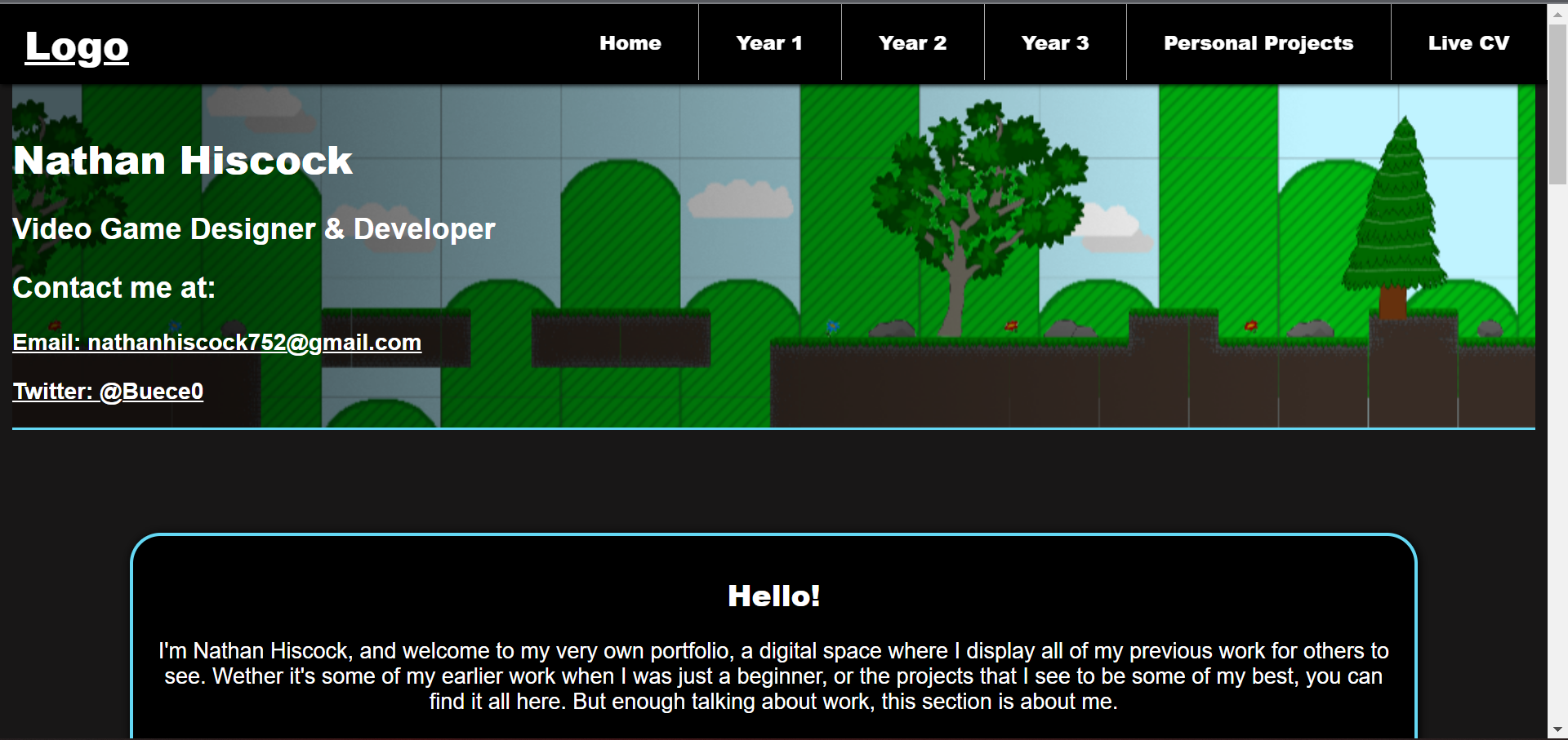
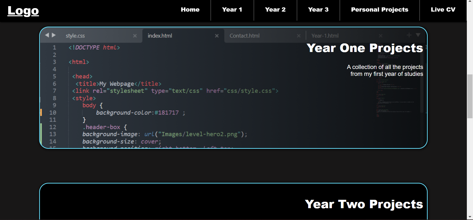
You can see that I have included a hero-image, which will constantly be updated with my best work, with the information name, role and contact, followed by a short message about me, so this is very true to the wireframe so far. I then included further links to the Year One, Two, Three and Personal projects pages, each having a hero image of the best piece of work from that timeframe. These link to similar looking pages with an image-link to each of my projects. I used the Sky-Blue Crayola colour as dividers and outlines for hero images. The Eerie has been used for the background colour and the white for most of the text. The Cinnabar colour has been used for very few things so far, but this is going to be used for things like settings checkboxes, maintenance messages etc.
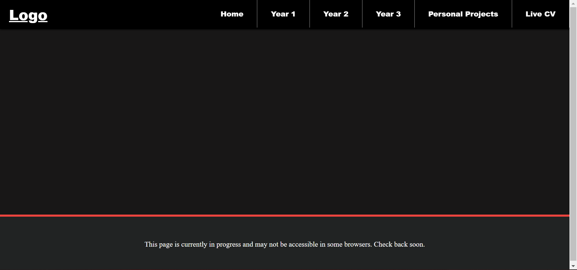
Website Maintenance and W.I.P Notification
I wanted to create a small and basic message that would display on pages that may not be finished yet or if a problem occurs on them. This way the viewer will be informed of this, and it will not affect their expectations of the quality of the other pages. This could be something that I develop in the future with a better style, but for now I feel that it does its job well enough.
Current and Future Developments
This section is about all the developments I am currently or hoping to work on for this website. Once these are complete, they will be accessible and seen in the development stage above.
Light & Dark Mode
This is a feature that is common in most websites and apps. It allows the user to select between a lighter background setup or a darker one. I tested what the opening of my Game Project page would look like with both styles.
This isn't a priority, but it may be a nice for users to have a choice between a lighter or darker look, depending on their preferences.
Image Zooming Options
This one I feel is a bit more important as some images on this website may be too small for some to see. So, adding a feature that allows you to view the images in a full-screen mode would fix this.
Sliding Information Boxes
I mentioned this in my wireframe, and it is still something I want to achieve. Again, not a priority by a nice design choice.
Website Logo & Favicon
Designing my very own logo to appear in the navbar and tab.
Live CV & Personal Pages
Probably the most important of my current tasks. Completing and expanding new and existing web pages.
Mobile View
Making sure that this website can be viewed properly on a mobile device.